Two flavors, four days, done in one.
Vaca Chips is a tortilla chip brand out of Newport Beach, California. They were launching two new flavors, Classic Ranch and Zesty Lime, and needed packaging mockups. I got the brief and sent everything back the same day.
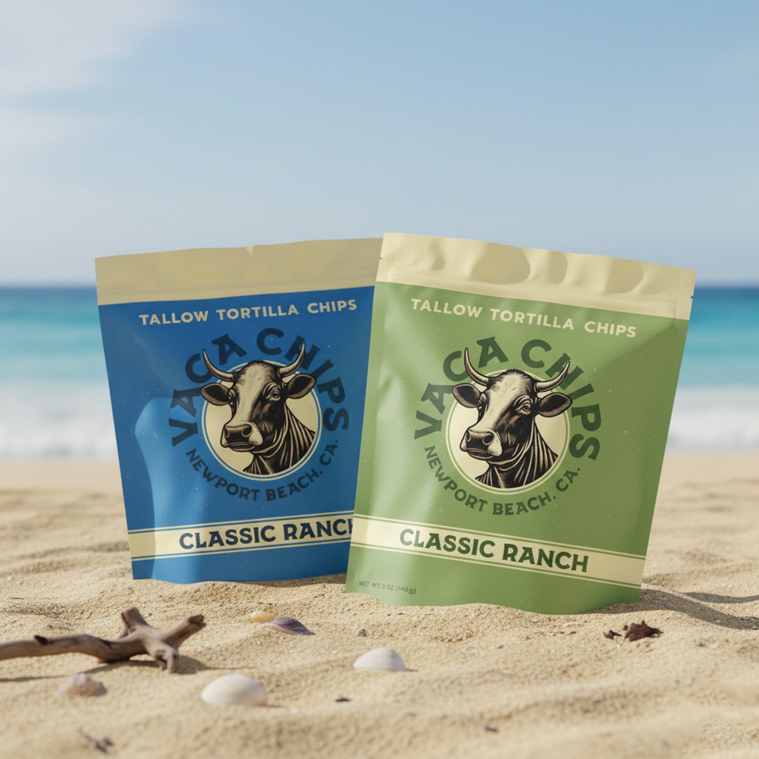
Show the bags, but show them somewhere.
The ask was straightforward: mockups of the new packaging so the team could see the flavors before print. Most mockups stop at a bag on a white background, which tells you the artwork is correct and nothing else.
Vaca Chips is a California brand. Newport Beach, cow on the logo, tallow tortilla chips, a whole laid-back identity already built into the label. So I put the bags in that world instead of on a table. Sand, sun, the light the brand actually lives in.
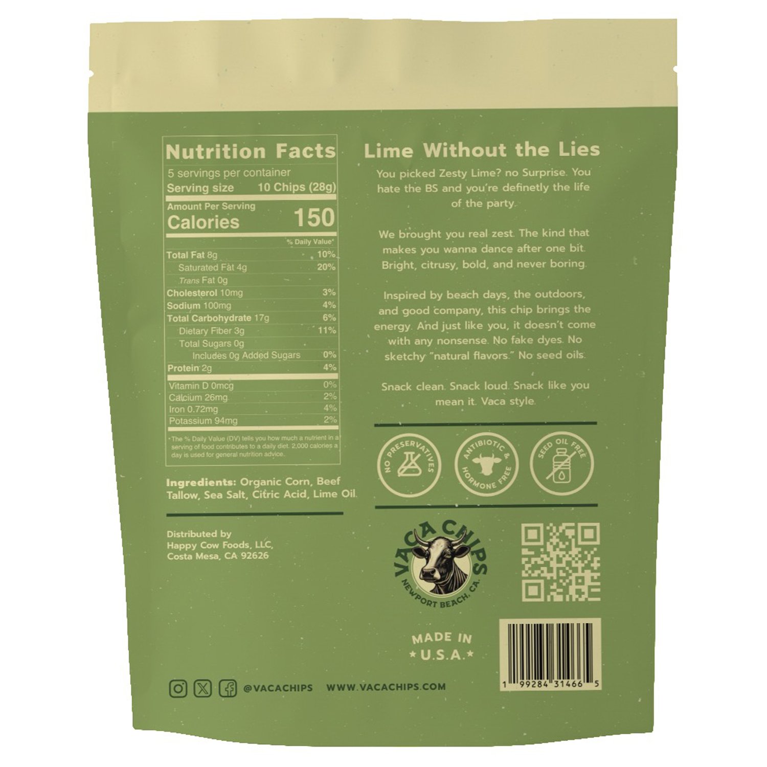
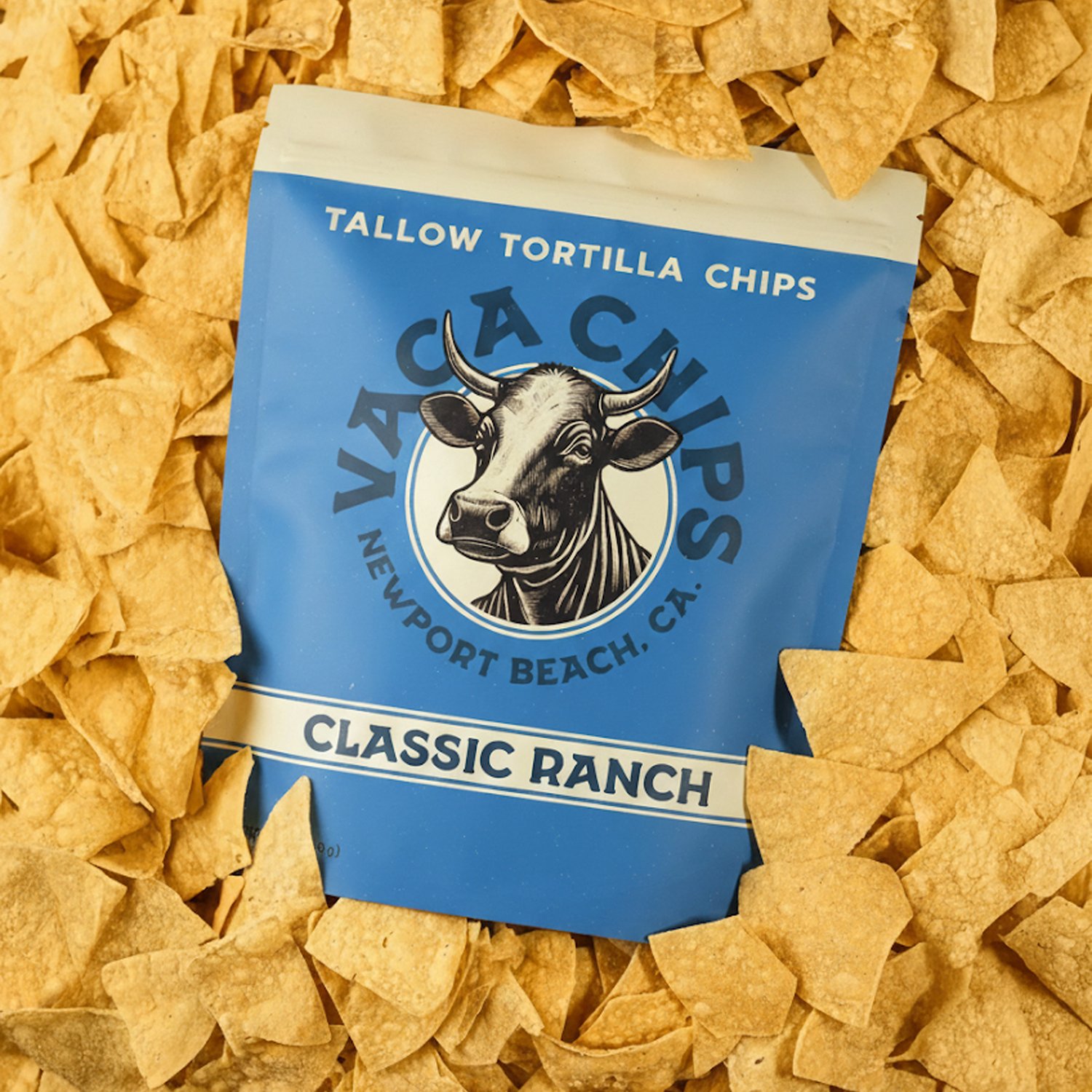
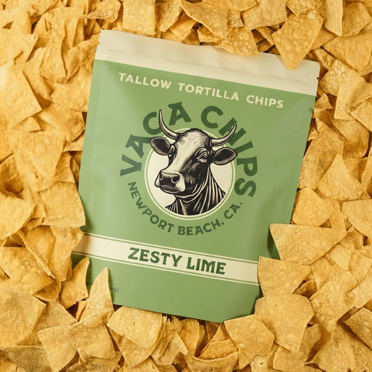
Front, back, and in the bath.
Each flavor got a full set: the front face for shelf and social, the back panel with the real information, and a chip bath shot where the product spills out around the bag, which is the frame that actually makes someone hungry.
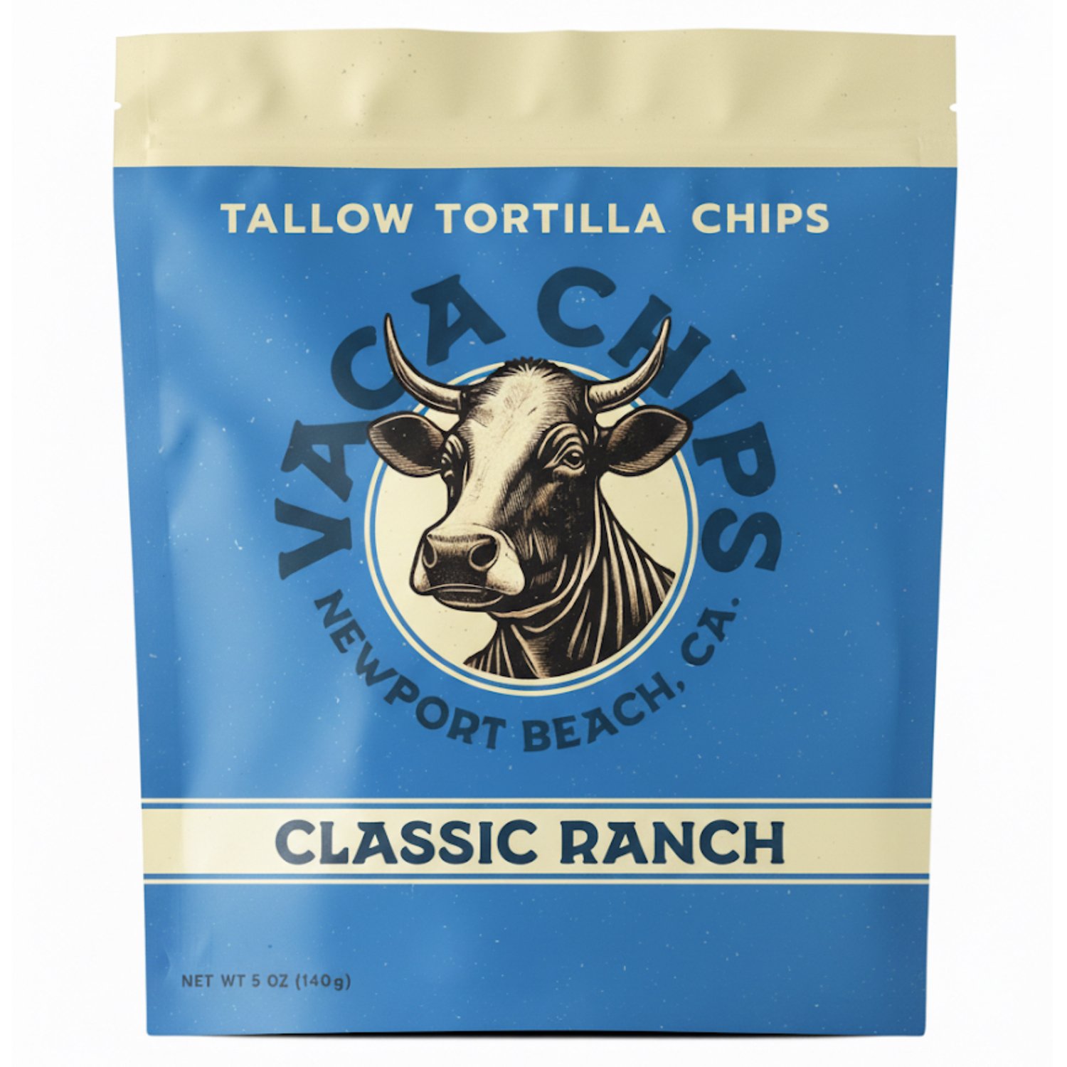
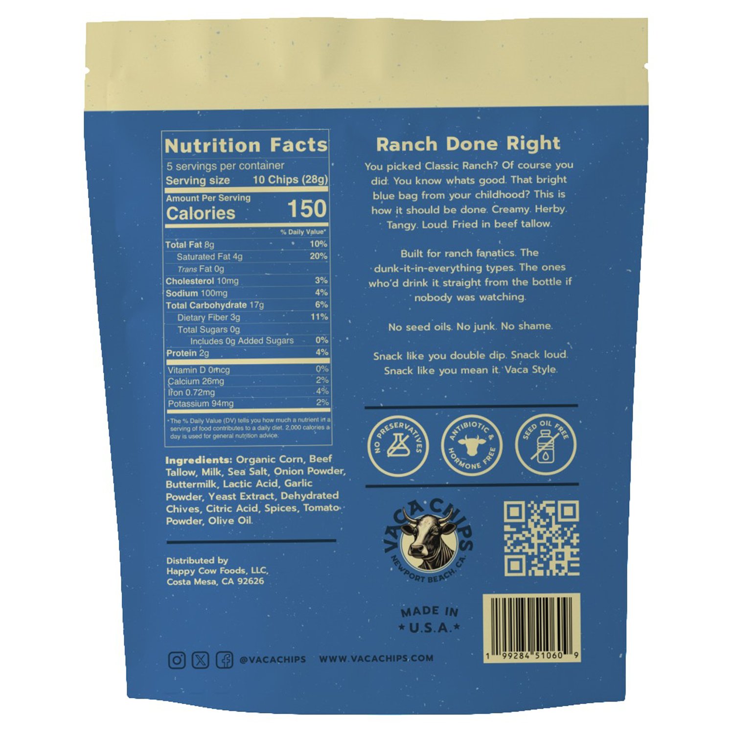
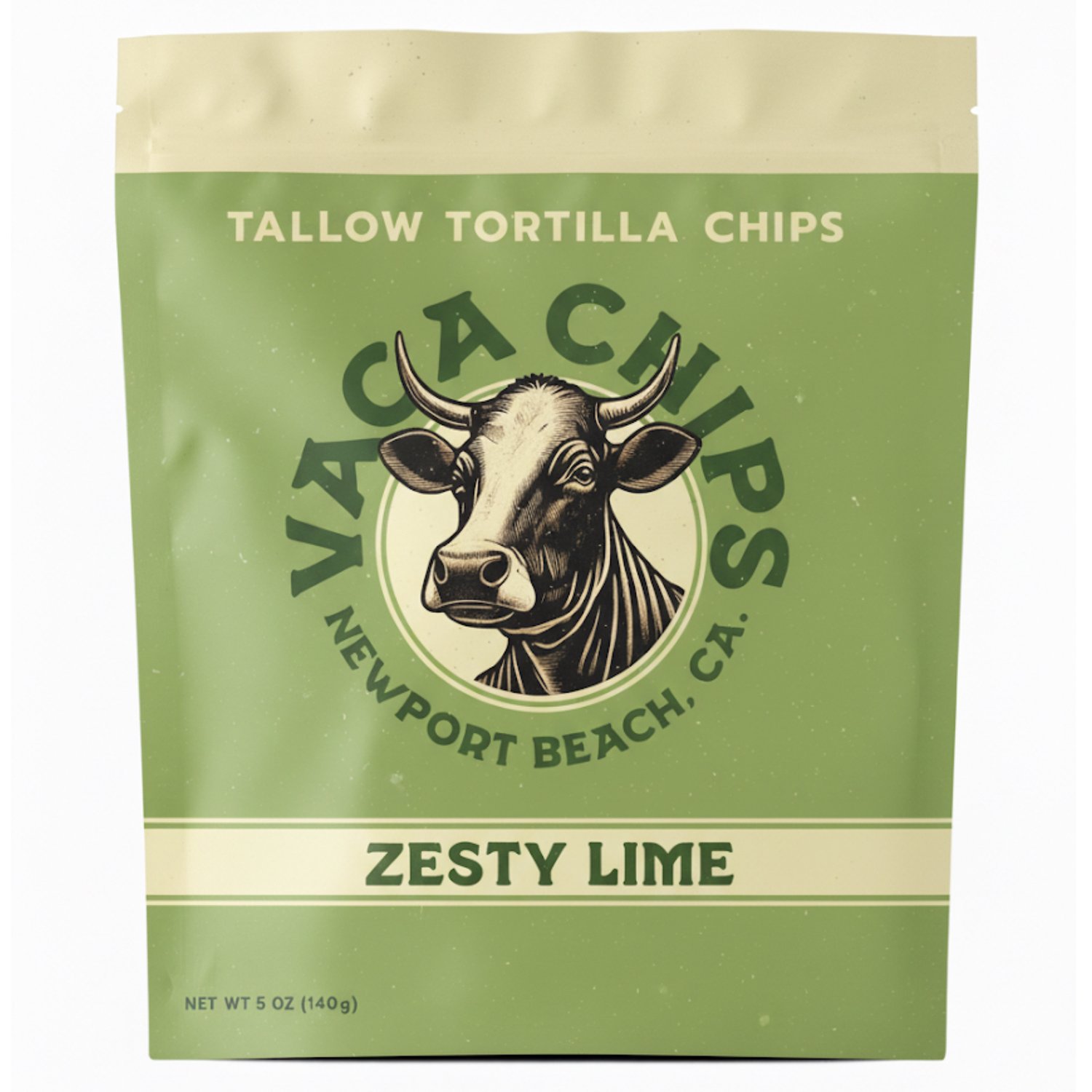
A surfboard nobody asked for.
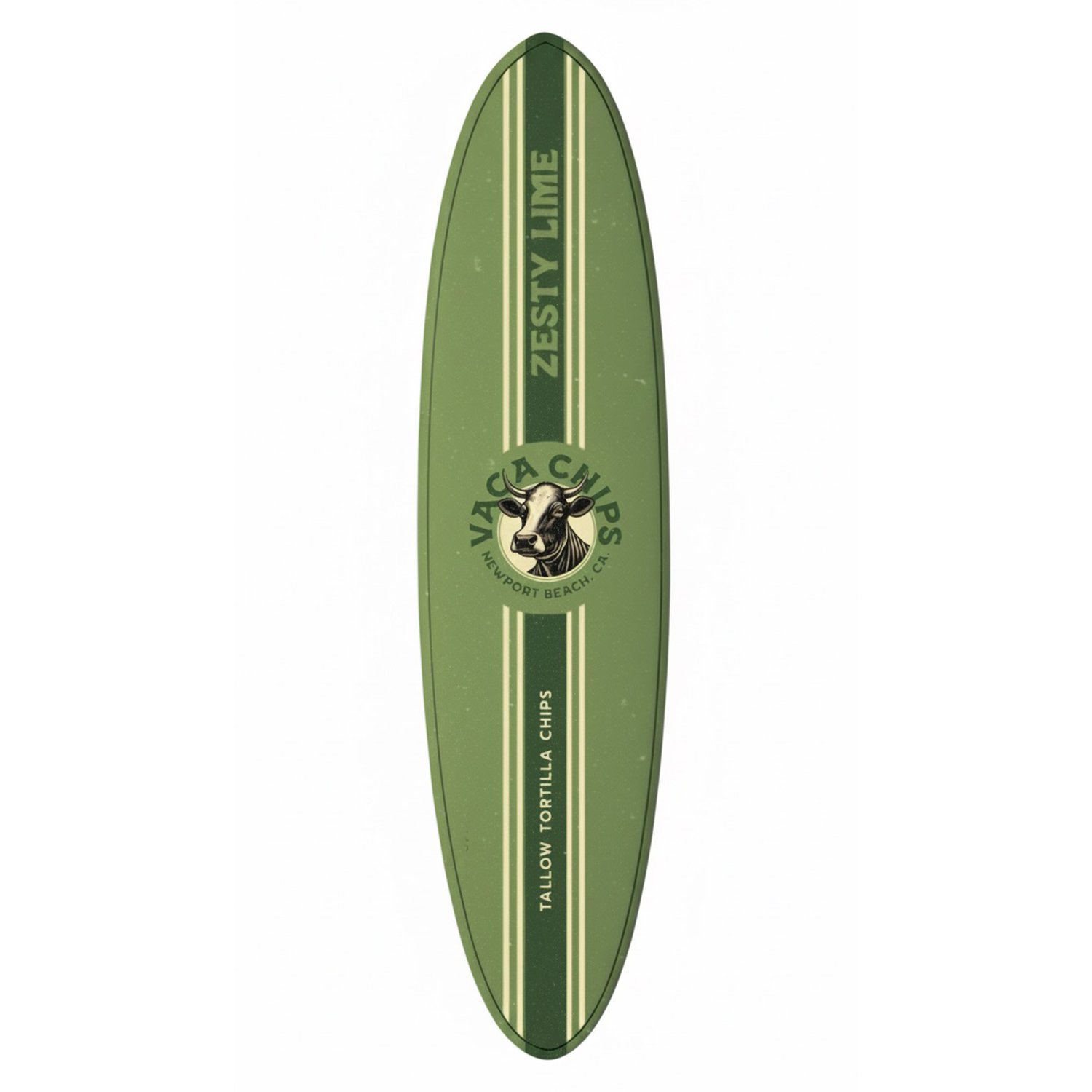
While I had their brand open, I kept going. If a chip brand belongs to Newport Beach, the flavor should be able to leave the bag and live on the things people already carry down to the water.
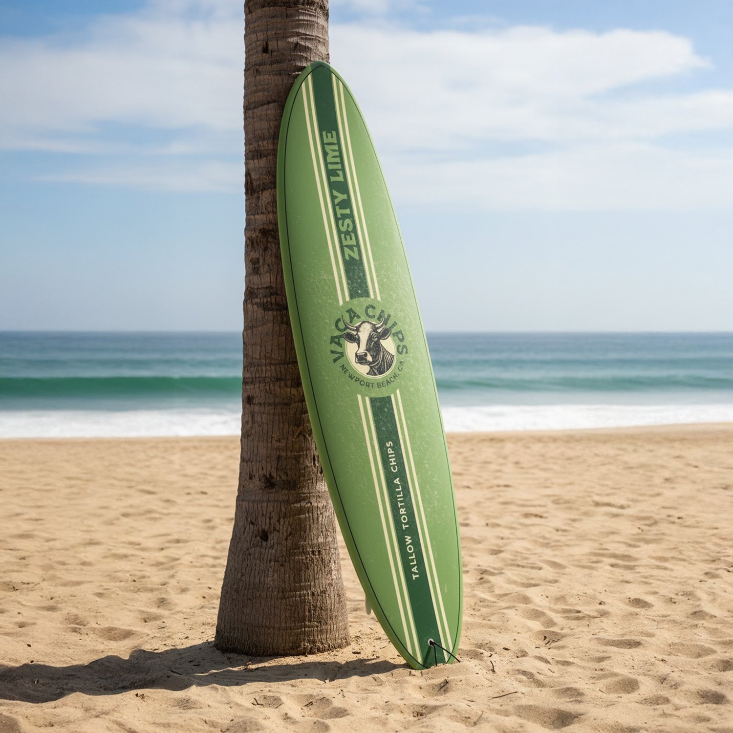
So I put Zesty Lime on a surfboard: the same green, the same stripes, the cow logo center deck. It is not packaging. It is the brand as an object someone would actually want, and a template for merchandise, beach activations, or a photo that makes the flavor feel like a place.
Delivered in a day.
Full set of mockups for both flavors, front and back, plus the chip bath frames and the surfboard concept, all back with the client on day one of a four day window.
They got their launch visuals three days early, in a form they could put straight on social instead of only using internally. And they walked away with an idea for where the brand could go next that they had not asked for and did not pay extra for.